How do I Customize the Invisible App?
- 02 Jul 2024
- 2 Minutes to read
- Contributors

- Print
- DarkLight
- PDF
How do I Customize the Invisible App?
- Updated on 02 Jul 2024
- 2 Minutes to read
- Contributors
- Print
- DarkLight
- PDF
Article summary
Did you find this summary helpful?
Thank you for your feedback
Description
The Invisible App lets you directly interact with customers and prospects without having to build, test, deploy, or support your custom apps.
The invisible app is invoked by a user by clicking on a URL link sent in either the SMS or the email (depending on the engagement type).
Settings
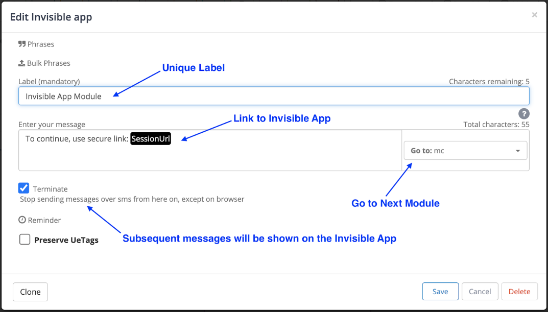
The two basic settings in the Invisible App module are:
Label: The label uniquely identifies this module inside the ushur for your reference.
Message: This message is autogenerated and contains the link to the Invisible App. You can customize the text before the link if you wish. The default is, “To continue, use secure link:...”
Terminate: When selected, send all following messages via Invisible App instead of text messages. In most cases this box is selected.
Customization
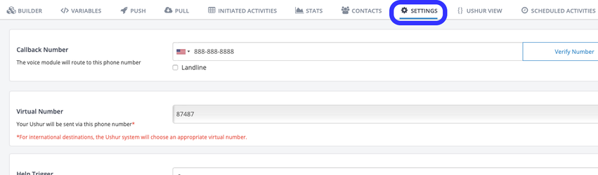
You can customize the appearance of the Invisible App engagement by clicking on the “Settings” tab, then scrolling down to the section titled “Invisible App”.
.png "image(912).png")
Here, you can configure each of the following settings to customize the appearance of the Ushur engagement:
Logo: Enter the link to the intended organization logo, or directly upload it from your computer.
Title: The title is displayed right under the logo. If left blank it will appear as “Title…”, so it is important to fill this out. The title is the title of that engagement such as “Insurance Survey”, or “New Claims Form” etc.
Description: Description of the engagement. This is shown on the homepage when looking at a list of past engagements.
Color: Enter the hex value of the color you want to use for the icons and buttons.
Message background color: Enter the hex value of the color you want to set the message background to.
Language of default text: Language setting for text displayed in the engagement by default.
Button text: Sets the text on the button that transitions between modules. Set to “Next” and “Done” by default (this setting can be configured at Module level as well).
Multiple Choice Button alignment: Sets the button placement of the answer choices of a multiple choice module.
Disabled calendar days: Blocks off certain calendar days when asking the user to select a date from the calendar.
End of engagement message: Message shown at the end of an engagement.
Edit message in footer: Short message shown in the footer of an engagement.
Example
.png "image(913).png")
Best Practice Tip
For a better white-labeling experience, use your company’s Favicon icon for the Invisible App URL. Please reach out to your CSM for more information.
Was this article helpful?