Form Module
- 03 Mar 2025
- 12 Minutes to read
- Contributors

- Print
- DarkLight
- PDF
Form Module
- Updated on 03 Mar 2025
- 12 Minutes to read
- Contributors
- Print
- DarkLight
- PDF
Article summary
Did you find this summary helpful?
Thank you for your feedback

The Form module helps you create a form for end-users to respond to different kinds of interactions on IA engagements on a single screen. For example, citizen developers can send a form to an end-user where they enter their details and answer multiple-choice questions during the process of an engagement.
To configure the Form module, follow these steps:
From the Modules list, drag and drop the Form module into the Inspector Panel or double-click the module.
Click the Form module to view the configuration window.
.png "image(84).png")
The Form module provides Static Elements and Form Elements options to help you design the Form for specific engagements with the user. These are non-configurable options:

Static Elements
.png "image(84).png")

The Display Text element in the Form Module allows users to add static, non-editable text to a form. This element is useful for providing instructions, descriptions, or additional context to guide users through the form. For example, it could be a tagline or a standard line to address the users.

Available Fields and Options
Text Editor
Users can enter and format the text that will be displayed in the form.
Supports basic text formatting options such as:
Bold (B) – Emphasize important text.
Italic (I) – Highlight key terms.
Underline (U) – Add emphasis to specific words.
Font Size and Alignment – Adjust text size and alignment (left, center, right, or justified).
Insert Tag
Allows users to dynamically insert predefined tags, such as placeholders for personalized information.
Example: Using
{FirstName}will dynamically populate the user's first name in the text.
Insert/Edit Link
The Insert/Edit Link dialog allows users to add hyperlinks to the Display Text element in the Form Module.
Configuration Options
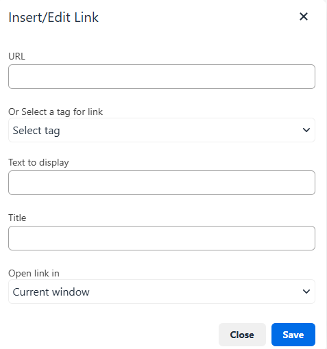
URL
Enter the web address (e.g.,
https://www.example.com) where the link should direct users.
Or Select a Tag for Link
Allows users to insert a dynamic tag instead of a static URL.
Tags automatically populate based on the custom data values or system-generated values.
Text to Display
Defines the clickable text that appears in the form.
Example: If "Click here" is entered, it will be displayed as a hyperlink.
Title
Optional tooltip text that appears when users hover over the link.
Helps provide additional context for the link destination.
Open Link In
Current window – Opens the link in the same browser tab.
New window – Opens the link in a separate browser tab or window.
Source Code Editor
Enables users to edit the Display Text in HTML format.
Clicking the Source Code icon opens an HTML editor where users can:
Customize text styling beyond the standard formatting options.
Add inline CSS styles or additional formatting tags.

The Display Image element in the Form Module allows users to add images to a form by uploading a file, entering a URL, or using a dynamic tag.

Available Fields and Options
Image Source
Users can upload an image, enter a URL, or add a tag to dynamically insert an image.
Supported file formats: JPEG, JPG, PNG, GIF, PDF.
Maximum file size: 6MB.
Browse Button
Opens a file selection window for users to upload an image from their device.
Preview Image
Displays a preview of the uploaded or linked image.
Image Alternative (Alt) Text
Provides a descriptive text for the image.
Helps with accessibility (screen readers) and SEO.
Question/Title Field
Used to specify a heading or question related to the image.
Label Field (Recommended)
Provides a label for the image input, improving form clarity. The Field Label ensures that a required field displays an asterisk (*).
Form Elements
The Numeric Input element in the Form Module allows users to enter numerical values, ensuring data accuracy for fields requiring numeric-only input.

Available Fields and Options
Question/Title Field
Defines the question or title for the numeric input field.
Example: "Enter your age" or "Provide the number of units purchased."
Field Label (Recommended)
Provides a label to describe the numeric input field clearly.
Helps users understand what information is required. The Field Label ensures that a required field displays an asterisk (*).
The Numeric Input element in the Form Module allows users to enter numerical values, ensuring data accuracy for fields requiring numeric-only input.

Add a Text Input Field
Navigate to the Form Module.
Locate the Text Input element under Form Elements.
Click or drag the Text Input element to the form builder area.
Configure Field Properties
Click on the newly added Text Input field.
Enter a Question/Title to define the purpose of the input field.
Example: "Enter your full name" or "Provide additional comments."
(Optional) Enter a Field Label to provide additional guidance.
Required fields will display an asterisk (*).
Save Input Data
Click the Field Menu (three dots).
Select Save Output.
Choose a tag where the input data should be stored.
Configure Error Messages
Click the Field Menu.
Select Modify Error Message (only available when a tag is selected).
Choose one of the following options:
Use Default Error Messages: Auto-populated based on the selected tag type.
Enable Dynamic Updates: If the tag type changes, the error message updates automatically.
Insert Variables: Type
{{in the error message field to open the variable menu and add attributes like numeric range or character limits.
Additional Field Customization
Click the Field Menu and select additional options as needed:
Make Field Optional: Allows users to skip this input.
Add Validation: Define input constraints.
Show/Hide Condition: Set visibility rules.
Hide User Input Value: Masks user input for sensitive data.
Manage Autofill Attribute: Enables autofill functionality.
(Optional) Click Delete Field if the input field is no longer needed.

The Radio Buttons element in the Form Module allows users to select only one option from a predefined set of choices. This is useful for collecting responses where only one selection is valid, such as gender, yes/no answers, or preference selections.

Available Fields and Options
Question/Title Field
Defines the question or title for the radio button group.
Example: "What is your preferred method of contact?"
Field Label (Recommended)
Provides a label to describe the radio button group clearly.
Helps users understand what they are selecting. The Field Label ensures that a required field displays an asterisk (*).
Radio Button Options
Each radio button represents a selectable option.
Users can enter a label for each option.
Click "Add another option" to include more choices.
The Dropdown element in the Form Module allows users to select one option from a predefined list of choices. It is useful for fields with multiple options while keeping the form compact.

Available Fields and Options
Question/Title Field
Defines the question or title for the dropdown.
Example: "Select your country" or "Choose a department."
Field Label (Recommended)
Provides a label to describe the dropdown field clearly.
Helps users understand the purpose of the selection. The Field Label ensures that a required field displays an asterisk (*).
Options Input Field
Users can enter a comma-separated list of values that will be displayed in the dropdown.
Example:
Red, Blue, Green, Yellow
The Checkbox element in the Form Module allows users to select multiple options from a predefined set of choices. It is ideal for cases where users may choose more than one applicable answer.

Available Fields and Options
Question/Title Field
Defines the question or title for the checkbox group.
Example: "Select your preferred communication methods."
Field Label (Recommended)
Provides a label to describe the checkbox group clearly.
Helps users understand what they are selecting. The Field Label ensures that a required field displays an asterisk (*).
Checkbox Options
Each checkbox represents a selectable option.
Users can enter a label for each option.
Click "Add another option" to include more choices.
The Date and Time element in the Form Module allows users to input date and/or time values, ensuring accurate time-based data collection.

Available Fields and Options
Question/Title Field
Defines the question or title for the date/time input field.
Example: "Select your appointment date."
Field Label (Recommended)
The Field Label ensures that a required field displays an asterisk (*).
Provides a clear description of the date/time field for users.
Selection Type Dropdown
Allows users to choose the input format:
Date – Users select only a date.
Date and Time – Users select both date and time.
The Signature Pad element in the Form Module allows users to provide a handwritten signature digitally, ensuring authenticity and consent in forms.

Available Fields and Options
Question/Title Field
Defines the question or title for the signature field.
Example: "Sign here to confirm your consent."
Field Label (Recommended)
The Field Label ensures that a required field displays an asterisk (*).
Provides a clear description of the signature requirement.
The Location element in the Form Module allows users to input or select a geographic location, making it useful for address collection, proximity searches, and location-based services.

Available Fields and Options
Question/Title Field (Mandatory)
Defines the question or title for the location input field.
Example: "Enter your preferred service location."
This is a required field and must be filled before proceeding.
Field Label (Recommended)
Ensures that a required field displays an asterisk (*).
Provides a clear description of the location input requirement for better user understanding.
Locations to Search For (Optional)
Users can enter a comma-separated list of specific locations to be searched (e.g., hospitals, pharmacies, schools).
Helps filter results based on predefined service providers.
Example: Hospitals, Schools, Pharmacies.
End-User Experience:
When a location is entered, the Google Maps UI updates and displays nearby service providers matching the predefined list.
If this field is not configured, Google Maps will only update to the entered location without showing specific service providers.
Location Search Radius (Optional)
Defines a search radius in miles to filter nearby locations.
Allows users to limit how far results should be displayed.
Example: Entering 10 restricts results to a 10-mile radius.
End-User Experience:
If configured, the Google Maps UI displays nearby locations within the specified radius.
If not configured, the map updates to the entered location without a radius-based filter.
The E-Signature element in the Form Module enables users to digitally sign documents using an embedded e-signature service via an iFrame. This is ideal for legally binding agreements, consent forms, and approvals.

Available Fields and Options
Field Label (Recommended)
The Field Label ensures that a required field displays an asterisk (*).
Helps define the purpose of the e-signature field.
iFrame Code
Users can paste an iFrame code to integrate an external e-signature solution.
Example: Embedding a third-party e-sign service like DocuSign or Adobe Sign.
The File Upload element in the Form Module allows users to upload files directly within a form, enabling document submission, identity verification, and record-keeping.

Available Fields and Options
Question/Title Field
Defines the question or title for the file upload field.
Example: "Upload your resume" or "Submit proof of identity."
Field Label (Recommended)
The Field Label ensures that a required field displays an asterisk (*).
Helps users understand the purpose of the file upload.
Supported File Types (Optional)
Users can specify allowed file formats, including:
JPG, JPEG, PNG, PDF, XLS, XLSX, TXT, CSV, DOC, and DOCX.
Restricts uploads to certain formats for compliance and compatibility.
Password Protection Prompt
Option to require users to enter a password for password-protected files.
Useful for handling sensitive or encrypted documents.
File Upload Limit
Defines the maximum number of files users can upload (10).
Ensures users submit only the required number of documents.
File Size Limit
Users can choose from the following options:
5MB
10MB (Default)
20MB
Prevents large file uploads that may slow down processing.
The Payments element in the Form Module enables users to collect payments directly within a form by integrating with a payment processor.

Available Fields and Options
Field Label (Recommended)
The Field Label ensures that a required field displays an asterisk (*).
Helps users understand the purpose of the payment field.
Payment Processor Integration
Allows users to select a payment provider for processing transactions.
Stripe
OrbiPay
Ensures secure and seamless payment collection.
Amount Field
Defines the payment amount to be collected.
Users can set a fixed amount or allow for a custom entry.
Supports multiple currencies, with USD ($) as the default.
After configuration, click the Save button to save the configuration and continue designing your workflow.
Once you have configured the Form module, you can Test Workflow to preview how the configured form will appear for the users.
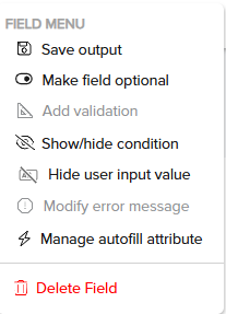
Click the More
 icon to view the Field Menu and customize the field:


Field Menu | Description | ||
Save Output | Allows you to save the output of the field to a tag or datatable by creating a new tag or saving to the existing tag. The tag will display only the appropriate data types for selection within the form elements.
| ||
Make Field Optional or Required | Renders the field as an optional or required field for user selection. On the Invisible App marks required fields with a "*" and labels optional fields as "(Optional)," providing clear guidance to users.
| ||
Add Validation | Allows you to add validation to the user’s input. Validation applies only to Numeric Input, Text Input, and Date and Time form elements. The validation option will be enabled based on the data types selected in the tags.
| ||
Show/hide conditions | Allows you to show or hide the form element if the condition is met.
| ||
Modify Error Message | Users can define and personalize error messages displayed when input validation fails across different modules. Previously, default system-generated messages were shown. Follow the below steps to configure:
| ||
Manage autofill attribute | User can assign specific autofill values like First Name, Email, etc., based on the type of input field selected. These autofill attributes help streamline the form-filling process for users by automatically populating commonly used information. This option is available in the field menu for various input types such as:
| ||
Delete field | Deletes the form element. |


Form Module Rendering: IA Chatbot/ IA Chatmode
The Form Module provides a dynamic user experience by presenting form elements to users. To streamline the data entry process and reduce cognitive load, the module introduces AI capabilities that optimize how questions are presented to the end user.
Note
The AI capabilities are only available in the IA Chatbot or IA Chat Mode.
How the AI Capabilities Work:
The Form Module provides a seamless user interface for various input elements, integrating AI to rephrase, combine, and manage questions efficiently. Below are the key features:
Rephrasing and Grouping of Questions

AI dynamically rephrases questions, making them clearer and more intuitive for end users.
The system can group multiple form elements, including:
Static Elements: Display Text, Display Image, and Display File.
Form Elements: Number Input, Dropdown, Text Input, and Toggle Switch.
Note
To prevent usability issues, AI will not combine more than 3 questions at a time.
Handling of Input Fields
Single Text Input vs. Combined Questions:
For individual text input or large text input questions, the response can be captured through the default chat input field.
If there are multiple combined questions, a separate input field is displayed above to capture all responses.
Partial Responses:
If a user answers partially (e.g., responding only to one part of a combined question), the remaining questions are shown, and the conversation continues until all values are provided. Only then is the next set of modules or questions presented to the user.
Text Input Summaries:

When a response is expected, users have the choice of entering it via the form element fields or through the main chat input field. Text input summaries provide a brief overview of the fields that need to be obtained, summarized in the assistant's chat bubble.
Special Handling of Specific Elements:
Large Input Fields: These questions are presented separately due to the need for more context and space.
Non-Combining Elements:
The AI does not combine the following elements, and they are presented one at a time:File Upload
Date and Time
Location
E-signature
Credit Card
Radio Buttons
Checkbox
Large Text Input
Enabling AI Capabilities
AI features can be enabled or configured during the Start and Setup process. Refer Ushur Settings.
Note
AI feature is an Enterprise setting. Please contact your Customer Success Manager to enable.
The Form Module's AI capabilities significantly improve the efficiency and clarity of the form-filling process. By understanding and leveraging these features, citizen developers can create user-friendly forms, streamlining and enhancing the overall experience for end users.
Was this article helpful?